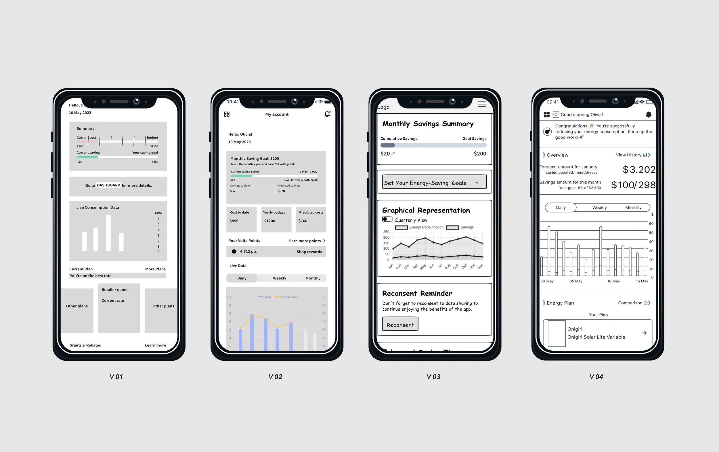
In this case study, I present my journey as a UX/UI Designer with VoltaRocks — who focus on developing an Energy-saving App that empowers users to manage their home's energy consumption, monitor savings, and uncover actionable tips for cost reduction. The project showcases my efforts in optimising user experience through innovative design solutions and strategic feature implementation.
Company
VoltaRocks
My Role
UX/UI Designer
Context
Optimise usability and elevate user experience by revamping the home screen of the VoltaRocks App and incorporating a new feature.
I am working at VoltaRocks as a UX/UI internship, leading the redesign of the VoltaRocks App's home screen and adding a new feature, 'Plan Hustler.' The primary challenges I encountered included a UI cluttered with data, which obscured the app's core functionalities, and the absence of design backup files, compounded by the steep learning curve associated with entering a new industry. My response was a methodical strategy—meticulous documentation, constant iteration, and active engagement with the product designer and development teams.
Duration
Jan 2024 - Mar 2024
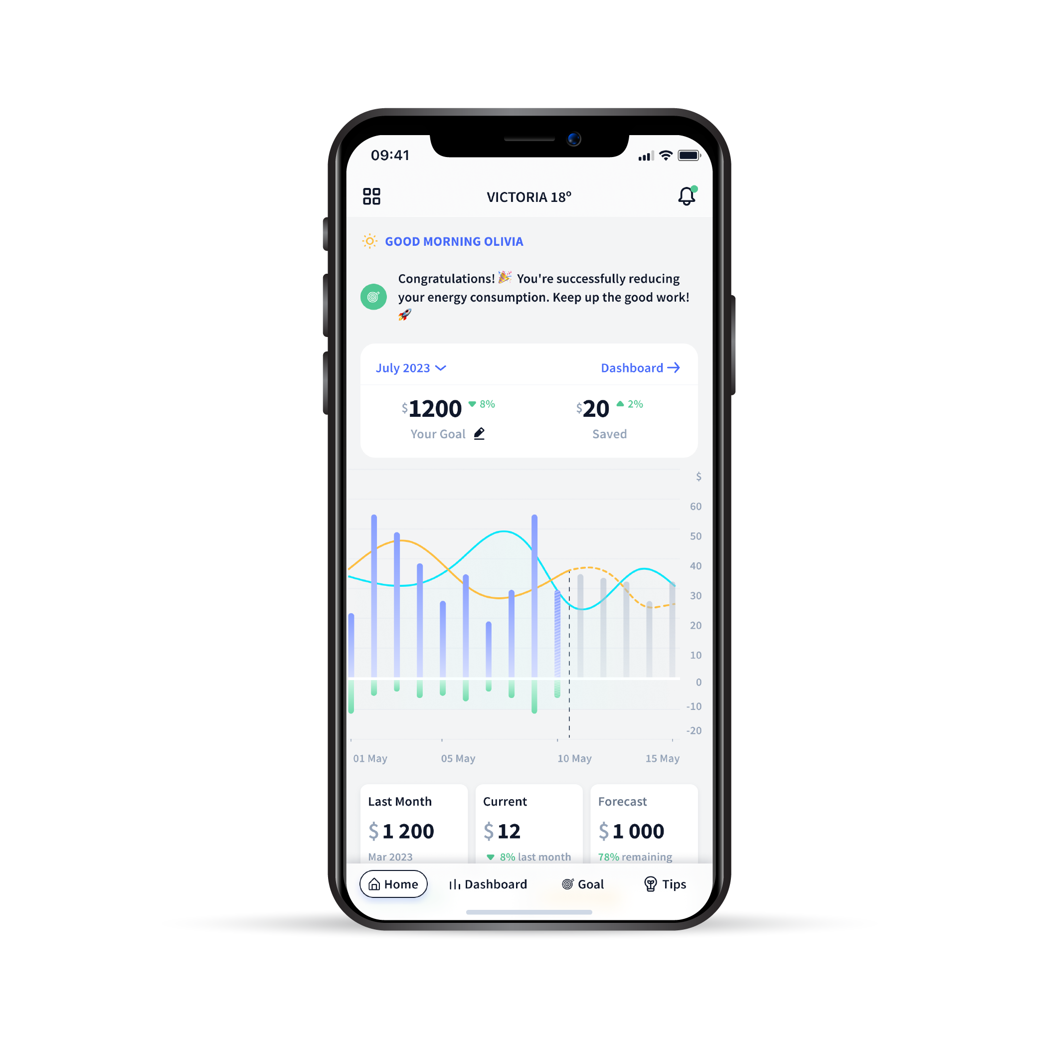
Previous Version of Home Screen
Process & Documentation
Delving into App Dynamics, User Insights, and Project Scope.
Project Goal
Elevating Energy Management: A User-Centric Approach.
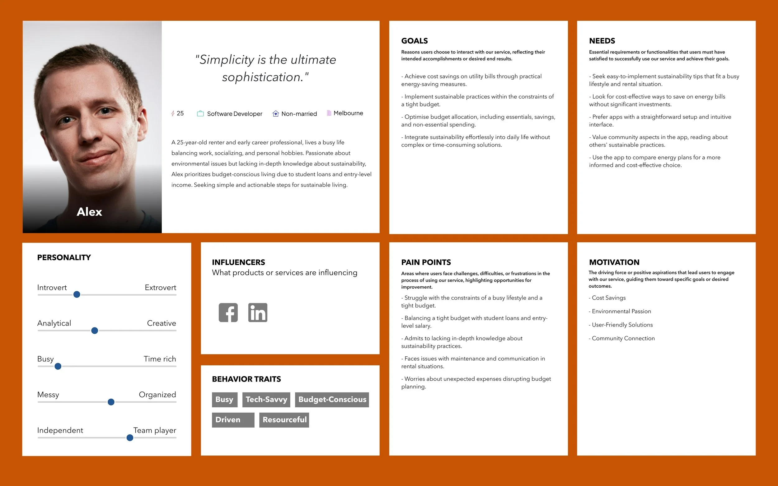
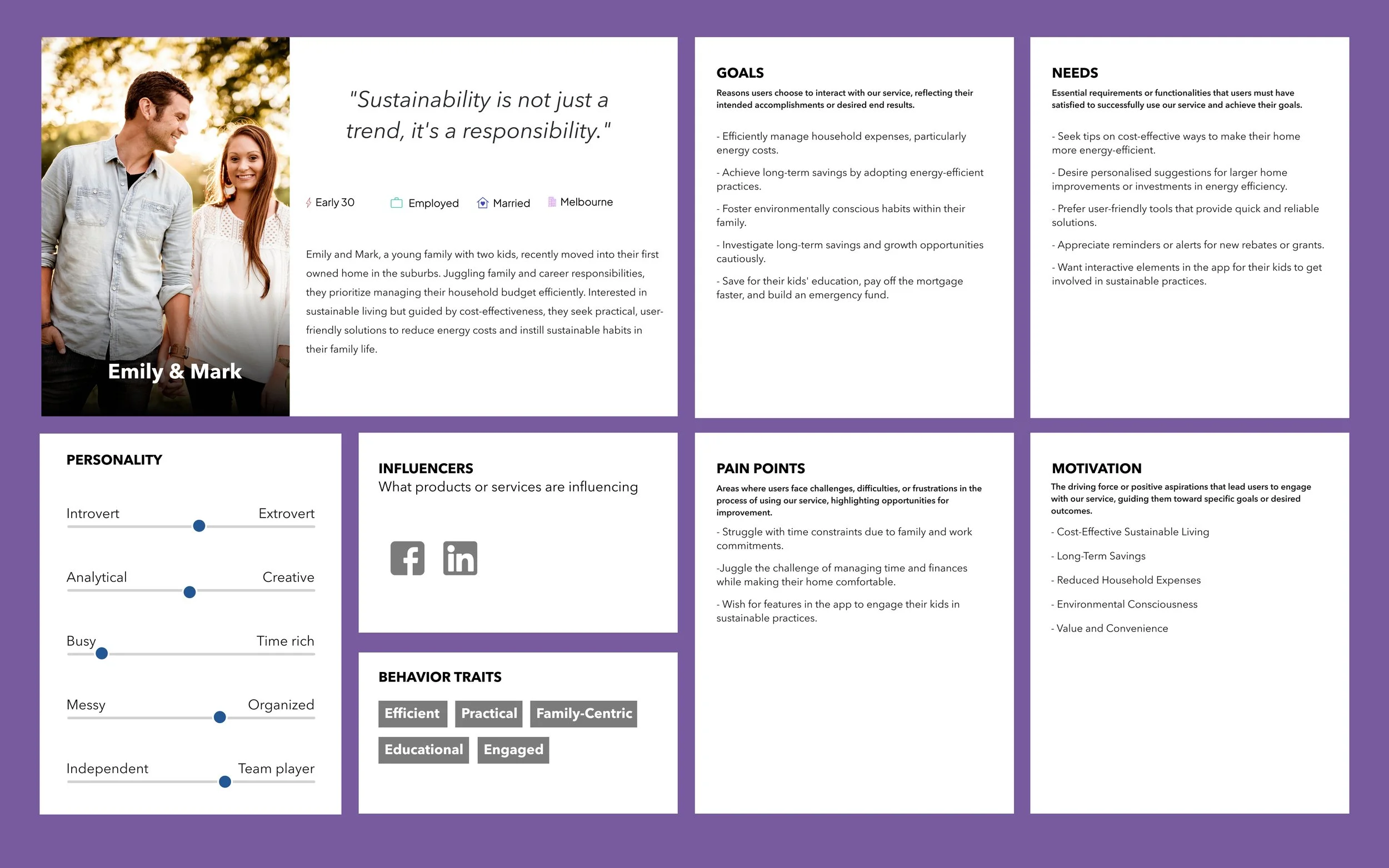
My journey through this project was grounded in a comprehensive understanding of the app's dynamics, user insights, and the broad project scope. Through user research, persona development, and empathy mapping, we uncovered key insights that directly informed the iterative design process. Collaboration with cross-functional teams was vital, ensuring a constant feedback loop and seamless integration of new features.
User Persona
Our goal with this project was to craft a seamless, informative, and engaging journey for users of the VoltaRocks App, focusing on optimising usability and introducing valuable new features. Through the redesign of the home screen and the addition of the 'Plan Hustler' feature, we aim to provide users with a comprehensive tool for energy management that is both easy to use and effective in promoting energy conservation.
Task 01
Redesign home-screen of VoltaRocks App
Problems
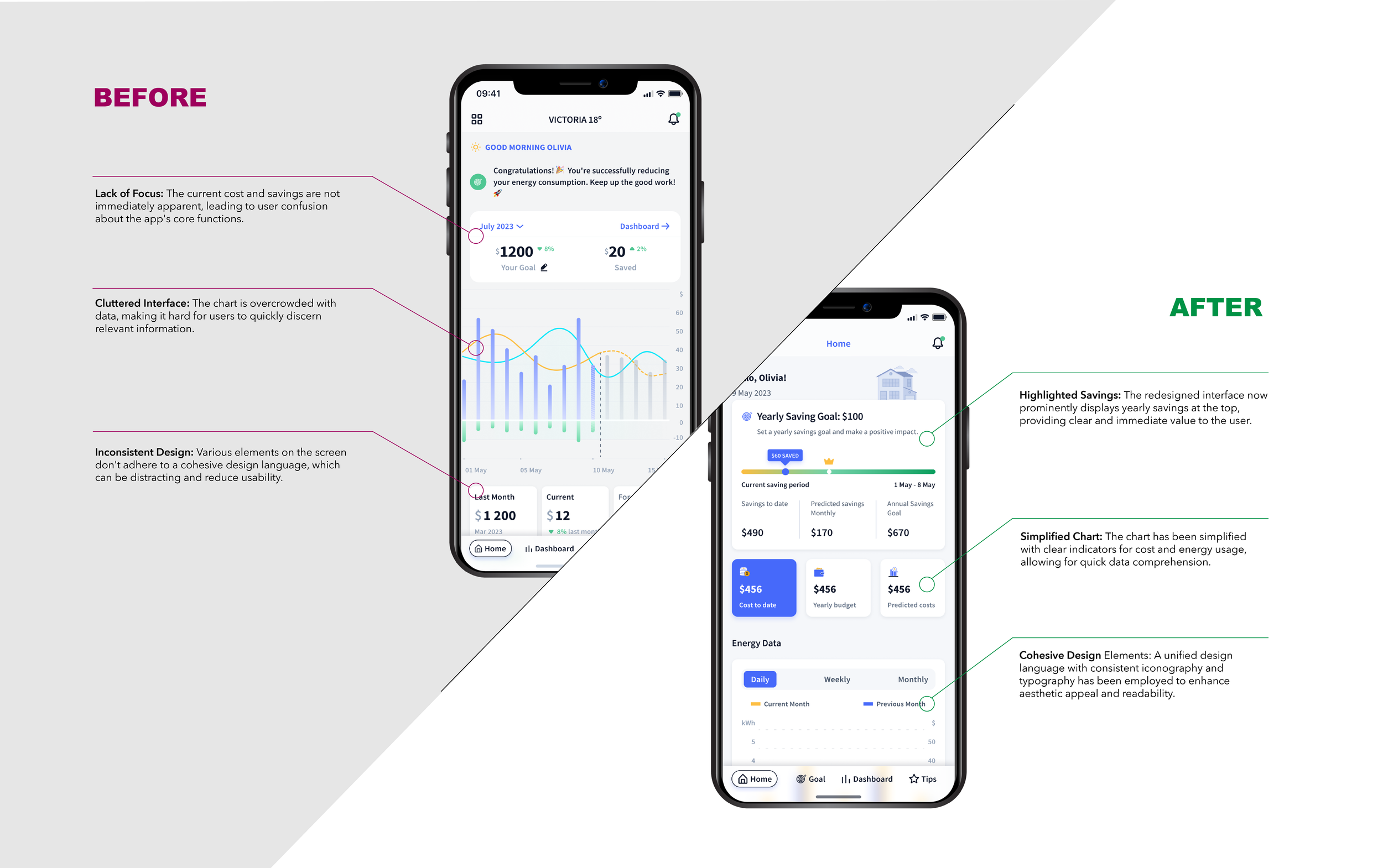
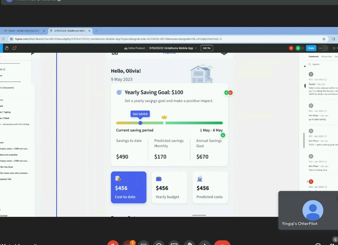
The initial home screen suffered from a lack of focus and clarity, presenting a cluttered interface and inconsistent design that hindered usability.
Usability Audit
Meeting with Development Team
Final Flow
Unclear information provided in the Summary box leads to user confusion, making it challenging for them to understand the data's value and rendering the app ineffective.
Approach
Conducting interviews, testing, and survey to effectively prioritise and consolidate information.
After crafting low-fidelity wireframes, we conducted online surveys and interviews with our user base. Notably, during these interviews, we conducted thorough design tests with professionals and regular users alike, acquiring crucial insights that significantly expedited our task completion process.
Design Decision
Low-Fi Wireframes
Balancing aesthetics with functionality, the design revisions prioritised clarity and utility.
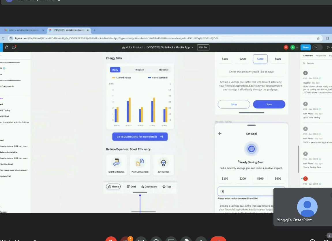
During the redesign of the home screen, I encountered another notable challenge: certain design elements I incorporated posed technical difficulties. Limited budget and developer resources made it challenging to implement some of the designs, such as integrating both live consumption and cost values within a single chart.
To address this challenge: I focused on the app's core objectives when finalising design choices for the home screen, opting to retain the live cost data chart while making other data accessible through the dashboard. Moreover, I maintained consistent communication with the development team to ensure the technical feasibility of all designs throughout the process.
The result: A transformed home screen that foregrounds key metrics, simplifies user interaction, and embodies a cohesive design language.
Outcome
“It’s so much easier to track my energy usage and savings now.”
The transformation is evident: clutter was replaced with clarity, and complexity gave way to intuitive design. Post-launch metrics and user feedback have been positive, demonstrating the success of the redesign in achieving its primary goal—making energy management simple and accessible.
Problems
The process of selecting energy plans was cumbersome and disjointed, often leading to frustration as users had to navigate through various platforms to gather information.
Users of the VoltaRocks app were required to resort to external websites for energy plan comparisons. The lack of an integrated comparison tool within the app forced users into a tedious, time-consuming process of cross-referencing data, leading to suboptimal decision-making and a disjointed user experience. The 'Plan Hustler' feature is envisioned to centralize and simplify this process by providing an in-app solution that seamlessly integrates energy plan comparison, fostering a more efficient and user-friendly experience directly within the VoltaRocks ecosystem.
Low-fi Wireframe
Task 02


